Work Inquiries

Get in touch:
hello@aipworks.com
Call us: +40 757 472 498

Brand style guide and private label for Sanvero

Creating the brand style guide and developing the packaging for Sanvero.

Task

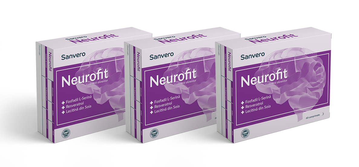
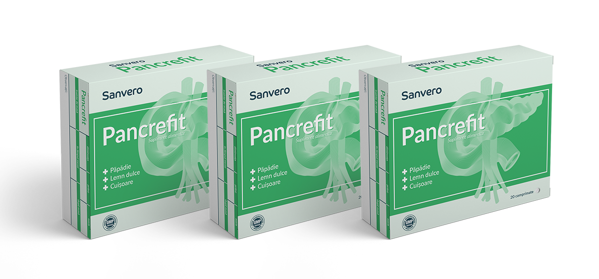
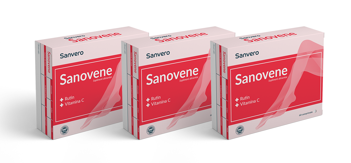
The brief was to create a brand that offers various food supplements at an affordable price with minimum costs for packing production. That means no embossing, no selective lacquering, no foils and keeping the colors at the minimum.

  • Strategy

    Visual Communication, Brand Guidelines

  • Design

    Art Direction, Graphic Design

  • Client

    Sanvero

  • Tools

    Illustrator, Photoshop, After Effects

  • Tags

    Packaging, Private label, Sanvero

PRIVATE LABEL DETAILS

Sanvero

Design dieline

Creating the cutlines and folds for all the packages to meet the standards for the shelves present in the pharmacies.

Design concept

The packaging layout needs to be minimalistic keeping the productions costs at a minimum. Flat design with stylized elements.

Visual hierarchy

The layout on the packaging is keeping the same visual hierarchy no matter the product. This way it is embedded into the mind of the consumer.

PRIVATE LABEL STRUCTURE

Sanvero

Packaging layout

The layout on the package has a very clear direction and it's kept through all the product iterations.

Color code

Each pack has a color code associated with the main element. This was researched within top-selling brands.

Design refinement

Making the final adjustments according to stakeholders' vision on the product range.

Let’s collaborate

Send us an email, to discuss a new project.

Our team is specially designed to create successful, innovative products from the initial concept through full product launch. We believe in adding value to our clients brands in order to draw the right attention and to capture the heart of the consumer.

Back